

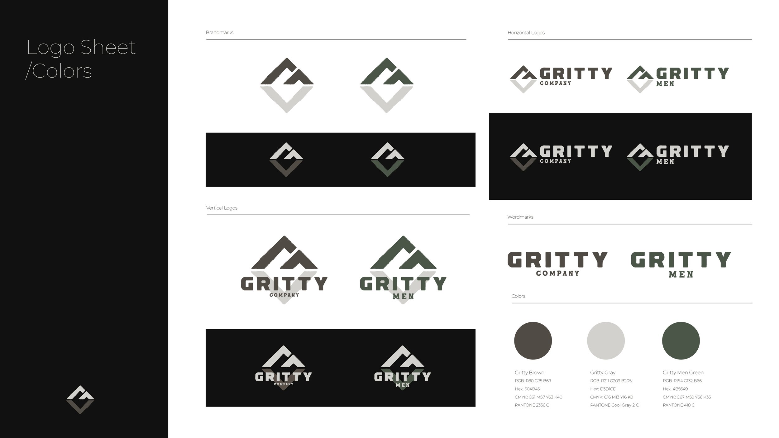


The Gritty Company is an outdoor company, and Gritty Men is its men's ministry. Aside from selling gear and apparel, Gritty holds events for personal growth, with the most recent being a one-day trek to summit Pike's Peak in Colorado.
There are two peaks forming the top of the logo. The bottom of the logo represents what lies beneath the surface. Digging deep to find the grit and determination to push beyond predetermined limits... and to push past adversity. The overall mark forms a G for Gritty.
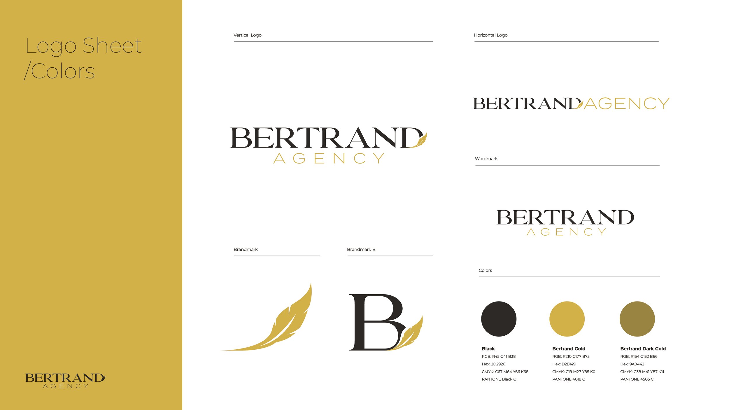
The concept behind the Bertrand Agency mark is three-pronged.
First is a humble nod to our connection with Goosehead.
Secondly, the mark instills a light, airy feeling, representing ease in the process and experience of working with Bertrand Agency.
And third, it is inspired by the etymology of the name Bertrand:
A medieval French form of the given name Bertram, the Bertrand surname means "bright raven," derived from the elements beraht, meaning "bright" or "intelligent" and hramn, meaning "raven."
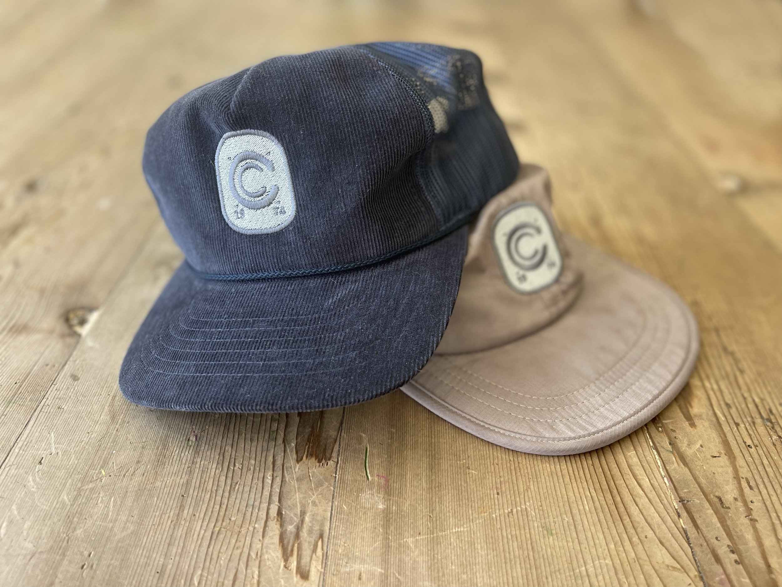
A 'molded' logo mark, badges, tees, hats and uniforms for an aluminum molding company founded in 1974.
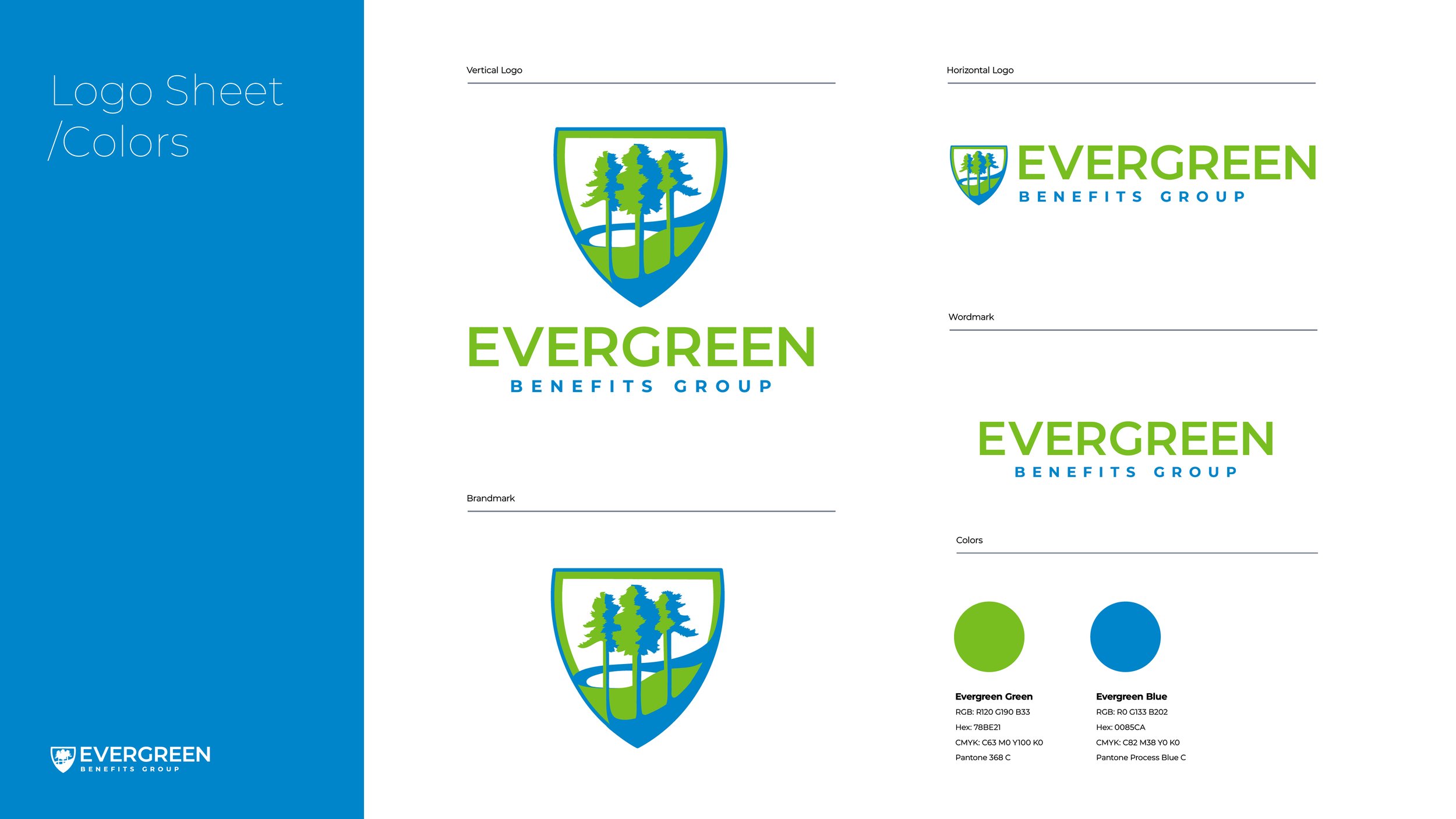
The Evergreen logo emits an organic and modern feel while paying homage to our exclusive partner, Blue Cross Blue Shield Texas. The tall loblolly pines amidst an east Texas landscape form the main body of the shield while establishing the east Texas heritage and area of operation.
The challenge was to rebrand an existing concert pavilion and in the process, fully integrate the new owner’s brand.
The result brings the excitement and energy of the venue to life and heavily brands the new pavilion for the client in the process.
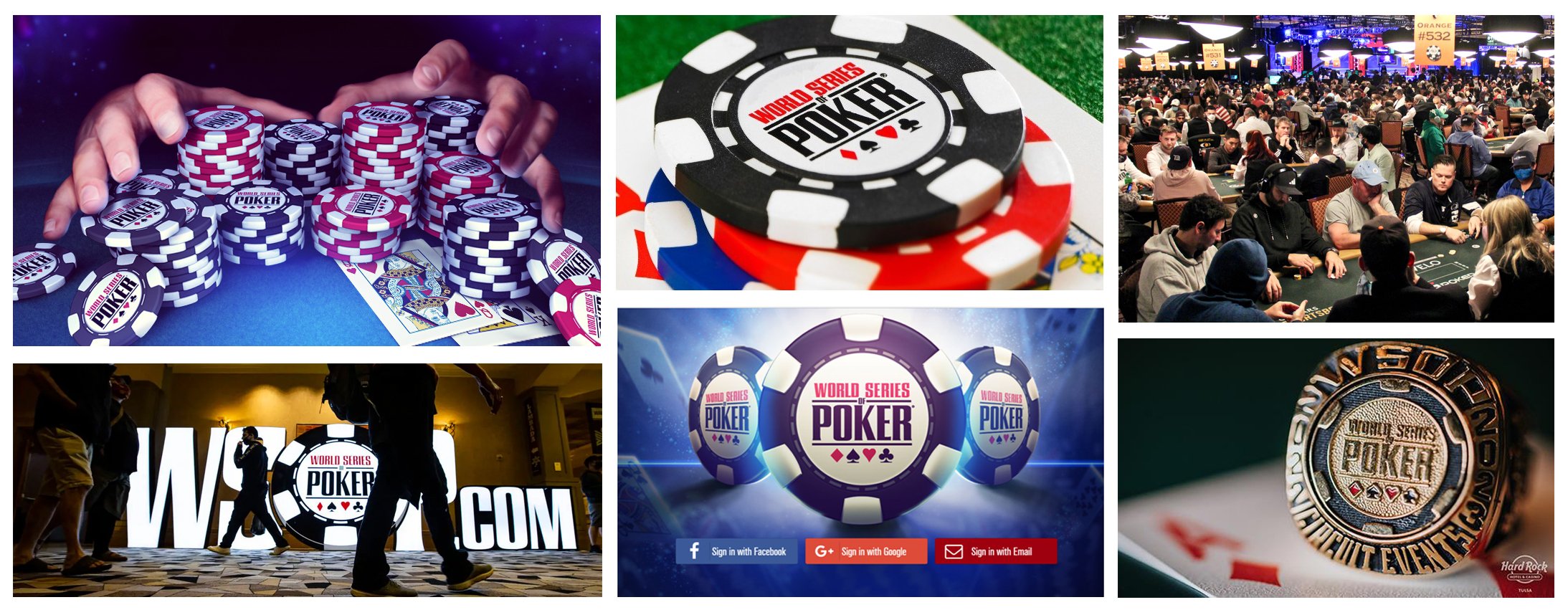
An old favorite… the brand we created for The World Series of Poker has continued to thrive after all these years.
Name and Brand Development
The name was inspired by the Round Table in King Authur’s court. A place where the knights of differing rank and station all had an equal say. This philosophy of equal say and contribution, aligned perfectly with the vision of the co-founders.
Logo, apparel, website and promo video for Six:11 Armor